Dashboards
Environment access levelThis section describes all general operations that a Subscription access level user can perform with Dashboards.
View device data on a dashboard
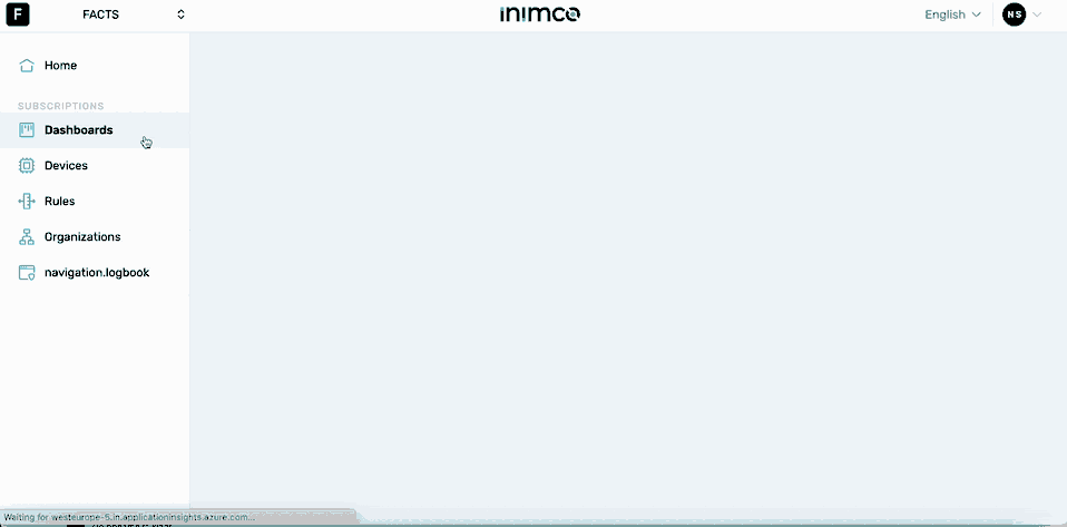
- Log in to Inimco.facts.
- Navigate to Dashboards.
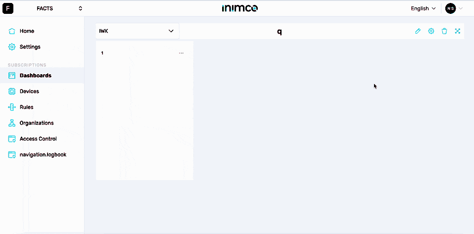
Create a dashboard
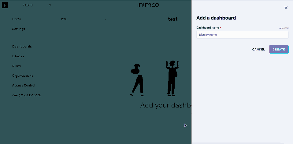
- Log in to Inimco.facts.
- Navigate to Dashboards.
- Click Create dashboard.
- Enter the dashboard name into the Dashboard name field.
- Click Create.
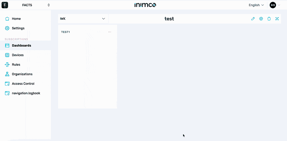
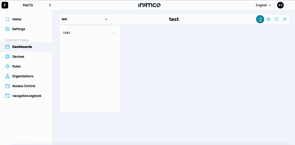
- Click Edit dashboard.
- Click the pencil icon in the top right corner.
- Select the required widget type.
- Click Next.
- Fill out the required widget parameters as described in Widgets.
- Click Submit.
- Click Save.
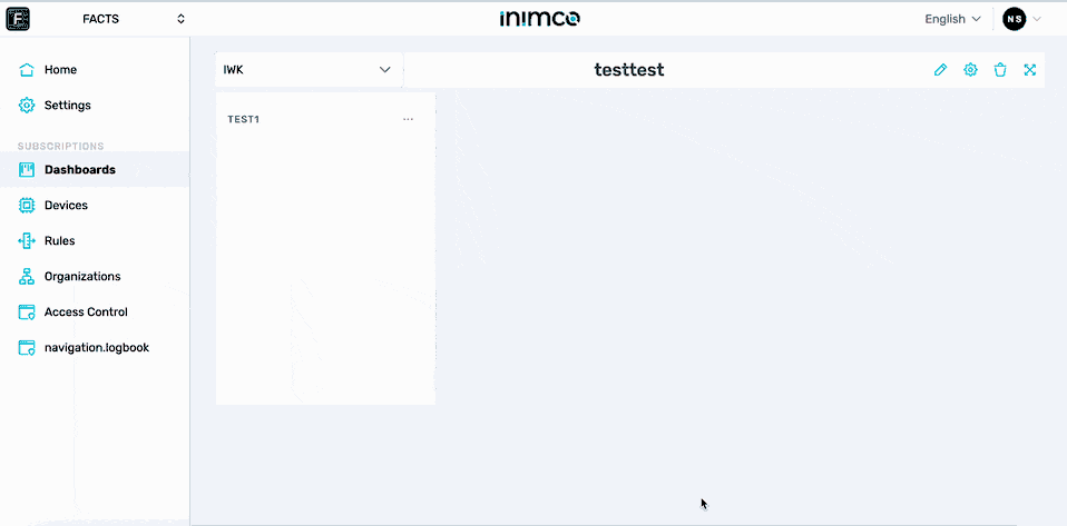
Edit a dashboard name
- Log in to Inimco.facts.
- Navigate to Dashboards.
- Click the gear icon in the top right corner.
- Enter the new dashboard name into the Dashboard name field.
- Click Update.
Edit a dashboard widget
- Log in to Inimco.facts.
- Navigate to Dashboards.
- Click the gear icon in the top right corner.
- Click the ellipsis (...) in the top right corner of the widget you need to edit.
- Click Edit.
- Fill out the required widget parameters as described in Widgets.
- Click Submit.
- Click Save.
Delete a dashboard widget
- Log in to Inimco.facts.
- Navigate to Dashboards.
- Click the gear icon in the top right corner.
- Click the ellipsis (...) in the top right corner of the widget you need to edit.
- Click Delete.
- Confirm deletion.
- Click Save.
Delete a dashboard
- Log in to Inimco.facts.
- Navigate to Dashboards.
- Click the bin icon in the top right corner.
- Type in the dashboard name.
- Click I UNDERSTAND, DELETE DASHBOARD.
Set up the Latest State widget
- Log in to Inimco.facts.
- Navigate to Dashboards.
- Click Create dashboard.
- Enter the dashboard name into the Dashboard name field.
- Click Create.
- Click Edit dashboard.
- Click the pencil icon in the top right corner.
- Select the required widget type.
- Click Next.
- From the Select a device menu, choose a device from which to receive telemetry data.
- From the Select a capability menu, pick a capability of the chosen device to display in the widget.
- In the Widget name field, input the name you want the widget to display.
- If required, apply conditional formatting to a value that this widget will show:
- Select the necessary condition from the condition field.
- Input the trigger value into the Value field.
- Enter the label name into the Label field.
- Choose the desired color.
- Click Submit.
- Click Save.
Set up the Line Chart widget
- Log in to Inimco.facts.
- Navigate to Dashboards.
- Click Create dashboard.
- Enter the dashboard name into the Dashboard name field.
- Click Create.
- Click Edit dashboard.
- Click the pencil icon in the top right corner.
- Select the required widget type.
- Click Next.
- From the Select a device menu, choose a device from which to receive telemetry data.
- From the elect capabilities menu, pick a capability of the chosen device to display in the widget.
- In the Widget name field, input the name you want the widget to display.
- Choose the necessary data aggregation type from the Select data aggregation type menu.
- Choose the time range for data collection from the Select time range field.
- Click Submit.
- Click Save.
Set up the Bar Chart widget
- Log in to Inimco.facts.
- Navigate to Dashboards.
- Click Create dashboard.
- Enter the dashboard name into the Dashboard name field.
- Click Create.
- Click Edit dashboard.
- Click the pencil icon in the top right corner.
- Select the required widget type.
- Click Next.
- From the Select a device menu, choose a device from which to receive telemetry data.
- From the elect capabilities menu, pick a capability of the chosen device to display in the widget.
- In the Widget name field, input the name you want the widget to display.
- Choose the necessary data aggregation type from the Select data aggregation type menu.
- Choose the time range for data collection from the Select time range field.
- Choose th evisualisation type from the Select visualisation menu.
- Click Submit.
- Click Save.
Set up the Microsoft 365 widget
- Log in to Inimco.facts.
- Navigate to Dashboards.
- Click Create dashboard.
- Enter the dashboard name into the Dashboard name field.
- Click Create.
- Click Edit dashboard.
- Click the pencil icon in the top right corner.
- Select the required widget type.
- Click Next.
- In the Widget name field, input the name you want the widget to display.
- In the Embed Code field, input the embedding code associated with the Microsoft 365 document or item.
Please use only the link to the document or item rather than copying the generated HTML directly from the web application.
- Click Submit.
- Click Save.
Set up the Power BI widget
Before proceeding, ensure that your Environment access level user has established a connection to the Power BI service on Inimco.facts as described here. Once that's in place, you can select the relevant connection from the PowerBIService Connection dropdown.
- Log in to Inimco.facts.
- Navigate to Dashboards.
- Click Create dashboard.
- Enter the dashboard name into the Dashboard name field.
- Click Create.
- Click Edit dashboard.
- Click the pencil icon in the top right corner.
- Select the required widget type.
- Click Next.
- In the Widget name field, input the name you want the widget to display.
- In the Power BI Widget Type dropdown, choose between embedding a 'Report' or a 'Dashboard', depending on the kind of Power BI visualization you aim to integrate.
- From the Power BI Resource dropdown, choose the specific report or dashboard you want to embed. This dropdown will populate based on the resources available through the selected PowerBI Service Connection.
- Click Submit.
- Click Save.
Set up the Embedded Application widget
- Log in to Inimco.facts.
- Navigate to Dashboards.
- Click Create dashboard.
- Enter the dashboard name into the Dashboard name field.
- Click Create.
- Click Edit dashboard.
- Click the pencil icon in the top right corner.
- Select the required widget type.
- Click Next.
- In the Widget name field, input the name you want the widget to display.
- In the Embed URL field, enter the direct URL of the application you intend to embed.
Please use only the link to the application rather than copying the generated HTML directly from the web application.
- Click Submit.
- Click Save.
Set up the Value Chart Average widget
- Log in to Inimco.facts.
- Navigate to Dashboards.
- Click Create dashboard.
- Enter the dashboard name into the Dashboard name field.
- Click Create.
- Click Edit dashboard.
- Click the pencil icon in the top right corner.
- Select the required widget type.
- Click Next.
- In the Widget name field, input the name you want the widget to display.
- From the Date Range dropdown, specify the timeframe for which you want to visualize the data.
- Select the desired rounding value from the Rounding field. If required, enhance the data visualization by toggling on the switches for Minimum, Maximum or Trends types of rounding.
- Click on the + Add Condition button to incorporate specific filters to your data.
- From the provided options, select a condition (equals, does not equal, is greater than, etc.) and input the corresponding data value in the Value field.
- Designate a name for the selected condition using the Label field.
- To visually distinguish the selected condition, pick a color from the Color selector. If required, you can continue to add more conditions.
- Click Submit.
- Click Save.
Set up the Heat Map widget
- Log in to Inimco.facts.
- Navigate to Dashboards.
- Click Create dashboard.
- Enter the dashboard name into the Dashboard name field.
- Click Create.
- Click Edit dashboard.
- Click the pencil icon in the top right corner.
- Select the required widget type.
- Click Next.
- Choose the relevant metric you wish to visualize from the Metric dropdown menu. This forms the core of what your heatmap will represent.
- Select the desired organizational unit from the Unit (Organization) dropdown menu.
- Select an appropriate aggregation type from the Aggregation Type dropdown. Options might include averages, sums, counts, or other aggregative measures.
- In the Widget name field, input the name you want the widget to display.
- From the Date Range dropdown, specify the timeframe for which you want to visualize the data.
- Adjust the resolution of the data on the horizontal axis using the Granularity X dropdown. This determines how data will be grouped on the X-axis, be it by days, weeks, months, or any other interval.
- Define the data resolution for the vertical axis with the Granularity Y dropdown. This sets how data will be segmented on the Y-axis, providing another dimension to your analysis.
- Click Submit.
- Click Save.
Set up the Value Chart Sum widget
- Log in to Inimco.facts.
- Navigate to Dashboards.
- Click Create dashboard.
- Enter the dashboard name into the Dashboard name field.
- Click Create.
- Click Edit dashboard.
- Click the pencil icon in the top right corner.
- Select the required widget type.
- Click Next.
- Choose the relevant unit or department from the Unit (Organisation) dropdown to tailor the data to a specific division or team within your organization.
- In the Widget name field, input the name you want the widget to display.
- From the Date Range dropdown, specify the timeframe for which you want to visualize the data.
- Define the desired number of decimal places in the Rounding field. Enhance your data visualization by toggling on the switches for Minimum, Maximum or Trends types of rounding.
- Click Submit.
- Click Save.
Set up the Donut Chart widget
- Log in to Inimco.facts.
- Navigate to Dashboards.
- Click Create dashboard.
- Enter the dashboard name into the Dashboard name field.
- Click Create.
- Click Edit dashboard.
- Click the pencil icon in the top right corner.
- Select the required widget type.
- Click Next.
- Click +Add Group button and define individual segments or categories within your donut chart, helping distinguish between varying data points or metrics.
- For each group, select the relevant data indicator from the Metric field. Each chosen metric will represent a distinct segment in the donut chart.
- Select the desired unit or department from the Unit (Organisation) dropdown.
- Select an option from the Aggregation Type field to define if the data should be summed, averaged, counted, etc. This influences how the metric is calculated and subsequently displayed in the chart.
- In the Widget name field, input the name you want the widget to display.
- From the Date Range dropdown, specify the timeframe for which you want to visualize the data.
- Click Submit.
- Click Save.
Set up the Canvas widget
- Log in to Inimco.facts.
- Navigate to Dashboards.
- Click Create dashboard.
- Enter the dashboard name into the Dashboard name field.
- Click Create.
- Click Edit dashboard.
- Click the pencil icon in the top right corner.
- Select the required widget type.
- Click Next.
- Click Blank canvas to start a new canvas, or click Copy canvas and select the canvas to use as a base.
- Enter the widget name into the Widget name field.
- Enter the canvas name into the Canvas name field.
- Click Continue.
- Customise the parameters as described below.
Top menu
| Menu Option | Description |
|---|---|
| Save | Saves canvas. |
| Delete | Clears all objects from the canvas. |
| Grid | Creates a background grid. Allows the user to define whether to use the grid and, if yes, set the grid cell size and color. |
| Zoom in | Zooms in. |
| Zoom reset | Resets the zoom. |
| Zoom out | Zooms out. |
| Undo | Undoes an action. |
| Redo | Redoes an action. |
| Copy | Copies a selected element. |
| Remove | Removes a selected element. |
| Preset of connectors | Presets the connectors. If required, use auto max connection height. Otherwise, set the max connection height yourself and adjust the connection positioning. |
| Line type | Allows selection of the line type for the path. |
| Connector type left | Enables selection of the connector type for the left side of the line. |
| Line type | Sets the line type. |
| Connector type right | Enables selection of the connector type for the right side of the line. |
| Canvas name | Adjusts the canvas name. |
| Show/hide left menu | Toggles the visibility of the menu on the left. |
| X | Goes back. |
Library
Basic shapes
Node
Click on NODE. This action will prompt the Node Properties window to appear on the right side of the interface.
Node styles
The Styles tab provides options to customize the appearance of the node.
To adjust the node dimensions:
- Navigate to the fields labeled Width and Height.
- Input desired dimensions for the visual representation of the node.
To add an image to the node:
- Click on the + UPLOAD button or enter the image url into the Image url or file field.
- After uploading, you can modify the image's aspect ratio as necessary. The aspect ratio attribute dictates how an element with a given aspect ratio should be scaled and positioned within a viewport of a different aspect ratio, allowing for specific alignment and scaling methods.
To edit the node's borders:
- Use the Border color dropdown menu to select the desired color for the Node's border.
- Use the Border width field to change the node's border width.
- Use the Border radius field to change the node's border radius.
To edit the stroke-dasharray attribute of the node:
- Input the required attribute into the Stroke Dasharray field. The stroke-dasharray attribute in SVG defines the pattern of dashes and gaps for outlining shapes, and can be applied to various SVG elements like
<circle>,<path>, and<line>.
To edit the node's background color:
- Select the required color from the Background Color field.
To edit the node's background opacity:
- Use the slider to determine how transparent or opaque the node's background appears.
Node labels
The Label tab offers functionalities to input and style textual labels for the node.
To add a text label to the node:
- Enter the text into the Label Text field's left section. You can alternatively add data bind input into the right section of the Label Text field. This is one of the data points that can be enbaled in the DATA & CALCULATIONS tab.
- Use the Label Font Size slider to adjust the label's font size.
To edit the label's background color:
- Select the required color from the Label Font Color field.
To rotate the label:
- Use the Rotate slider.
Node connectors
The Connectors tab provides feature to create and customize connections between nodes.
To enable connectors:
- Select the required connection places from the Connections dropdown. If required, use the auto connection sort and fit the connection to the node size.
Data and calculations
The Data and Calculations tab provides the functionality to establish data points on the canvas and define calculations based on these data points.
To define a data point:
- Click on Data Points + button.
- From the Device Field, choose a device.
- From the Range Capability Field, select the desired capability.
- Click Submit.
To create a calculation:
- Input a formula into the designated formula field, e.g., +A1+A2, where A1 and A2 are the previously defined data points.
- Click Submit.
Label
Click on LABEL. Upon this action, the Label Properties window will emerge on the right side of the interface.
Label styles
The Styles tab offers diverse options to customize the appearance of the label.
To rotate the label:
- Utilize the Rotate slider.
To modify the label's borders:
- Choose the desired color from the Border Color dropdown. Data bind input can also be set here.
- Adjust the border width using the Border Width field.
- Alter the border's curvature using the Border Radius field.
For the stroke-dasharray attribute:
- Enter the needed attribute in the Stroke Dasharray field. This attribute defines the dashes and gaps pattern used in outlining shapes.
To adjust the label's background:
- Pick the desired color from the Background Color dropdown. Data bind input can also be set in this field.
- Use the Background Opacity slider to set how transparent or opaque the label's background should appear, data bind input can be adjusted here too.
For the label's font customization:
- Use the Font Size slider to determine the size of the label text.
- Choose the desired color from the Font Color dropdown. Data bind input can also be set here.
- Pick the desired typeface from the Font Family dropdown.
Label text
The Text tab is dedicated to managing the label's textual content.
To input and manage label text:
- Input your desired text into the Text field. Data bind input can also be adjusted in this section.
- If you want the label size to adjust automatically to the text, choose the auto setting. If a specific size is desired, manually input dimensions into the Width and Height fields.
Legend
Click on LEGEND. This action will reveal the Legend Properties window on the right side of the interface.
Legend styles
The Styles tab provides options to customize the appearance of the legend.
To adjust the legend's font:
- Use the Font Size slider to modify the text size.
- Choose the desired color from the Font Color dropdown. You also have the option to set the data bind input here.
Legend items
The Items tab allows you to specify the contents of the legend.
To add and manage legend items:
- Enter the desired item name into the Item Name field.
- Pick the preferred color for the legend item from the Color dropdown.
- Adjust the color's transparency using the Opacity slider.
- To include more items to the legend, click the + button.
Path
Click on PATH. This action will prompt the Line Properties window to appear on the right side of the interface.
Path styles
The Styles tab provides options to customize the appearance of the path.
To set the path label:
- Navigate to the Value field.
- Input the desired text or set the data bind input.
To enable connection scaling:
- Check the Use Connection Scale option.
For defining the path's arrows:
- Use the Source Arrow dropdown to select the preferred source arrow style.
- Use the Target Arrow dropdown to select the preferred target arrow style.
To set the path's outline:
- Input the desired pattern into the Stroke Dasharray field.
To adjust the path's background:
- Select the desired background color from the Background Color dropdown. A data bind input option is also available here.
- Use the Background Opacity slider to determine the background transparency. This slider also offers a data bind input option.
- For a gradient background, toggle on the Use Gradient Color switch and then pick the desired gradient colors.
Path label
The Label tab provides functionalities for the path's label.
To input label text:
- Enter your content into the Text field. You can also use macro (0) for value substitution and set data bind input if needed.
- Define the position of the label using the Position X dropdown for the X-axis and Position Y dropdown for the Y-axis.
For label appearance:
- Rotate the label using the Rotate slider.
- Set the border color for the label using the Border Color dropdown. A data bind input option is available here.
- Adjust the border width with the Border Width field and the border radius with the Border Radius field. The stroke dasharray can also be customized here.
- Pick a background color from the Background Color dropdown and set its opacity with the Background Opacity slider. Both of these offer data bind input options.
- Use the Font Size slider to set the size of the font, and choose a color with the Font Color dropdown. Again, a data bind input option is provided. Finally, select the desired font type from the Font Family dropdown.
Advanced Shapes
Click on any of the available shapes (e.g., engines, compressors, filters, flow sensors, piping, crushers grinding, fittings, separators, agitators, apparatus elements, centrifuges, compressors IDO, driers, feeders, heat exchangers, mixers, pumps, pumps DIN, pumps ISO, shaping machines, vessels, valves, miscellaneous). Upon selection, the Figure Properties column will appear on the right side of the interface.
Advanced Shape Styles
The Styles tab provides options to customize the appearance of the advanced shape.
To rotate the element:
- Use the Rotate slider.
To scale the element on the X axis:
- Use the Scale X slider.
To scale the element on the Y axis:
- Use the Scale Y slider.
To edit the element's borders:
- Select the desired color from the Border Color dropdown (data bind input is also available).
- Adjust the width using the Border Width field.
- Modify the radius with the Border Radius field.
To define the stroke-dasharray attribute:
- Input the required attribute into the Stroke Dasharray field.
To edit the element's background color:
- Select the desired color from the Background Color dropdown (data bind input is also available).
To set the element's background opacity:
- Use the Background Opacity slider to determine the desired transparency level (data bind input is also available).
Advanced Shape SVG
The SVG tab displays the SVG code of the icon, representing the selected advanced shape.